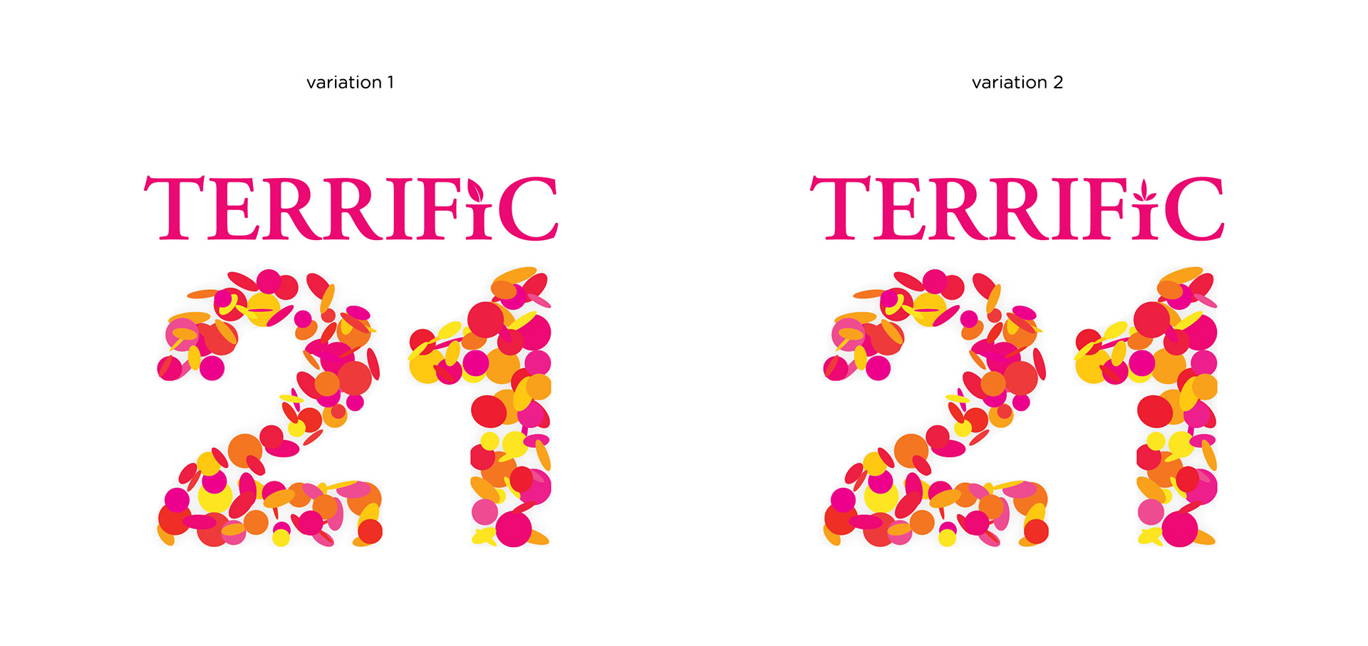
BHG 21ST ANNIVERSARY ICON
Creative Rationale: Terrific 21 marks a significant milestone of BHG. With the use of organically shaped circle confetti, it makes out the number 21 in an abstract unique form. It portrays the 'call for celebration' based on the colours used and how the shapes flow throughout.
The typeface used for 'terrific' is Adobe Garamond Pro, which is organic and simple yet contemporary as well. The little leaf used helps to subtly accentuate the eco-friendly vibe.
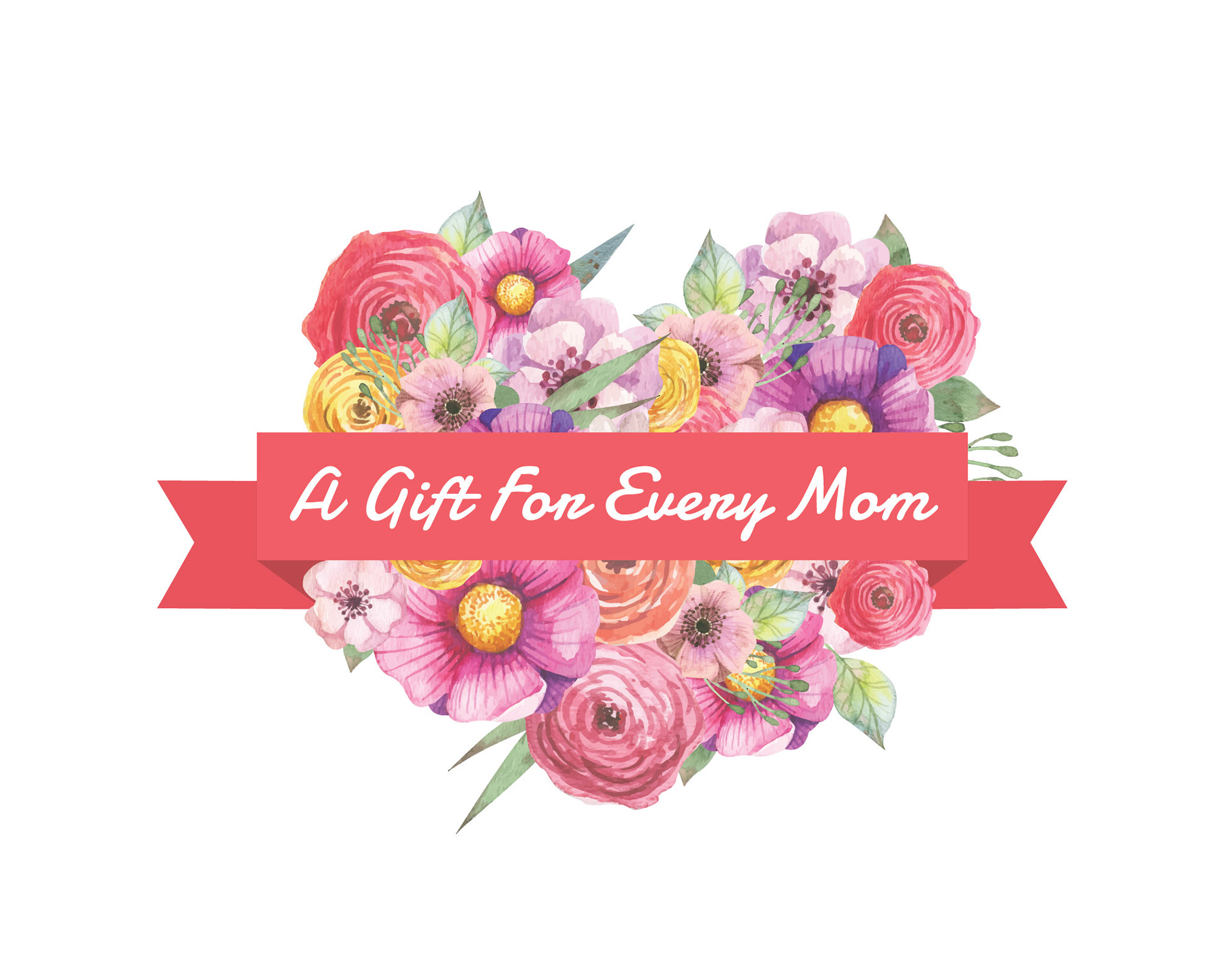
MOTHER'S DAY ICON
Creative Rationale: Of all the gifts that life has to offer, a mother is the greatest of them all; a collection of different types of beautiful flowers shaped into a heart with a ribbon across. This subtly brings out the impression of a gift itself.
The sweet feminine look portrays a mother's gentleness and elegance. This icon can easily blend in with any collateral as it gives a soft and appealing touch to any artwork as an enhancement.
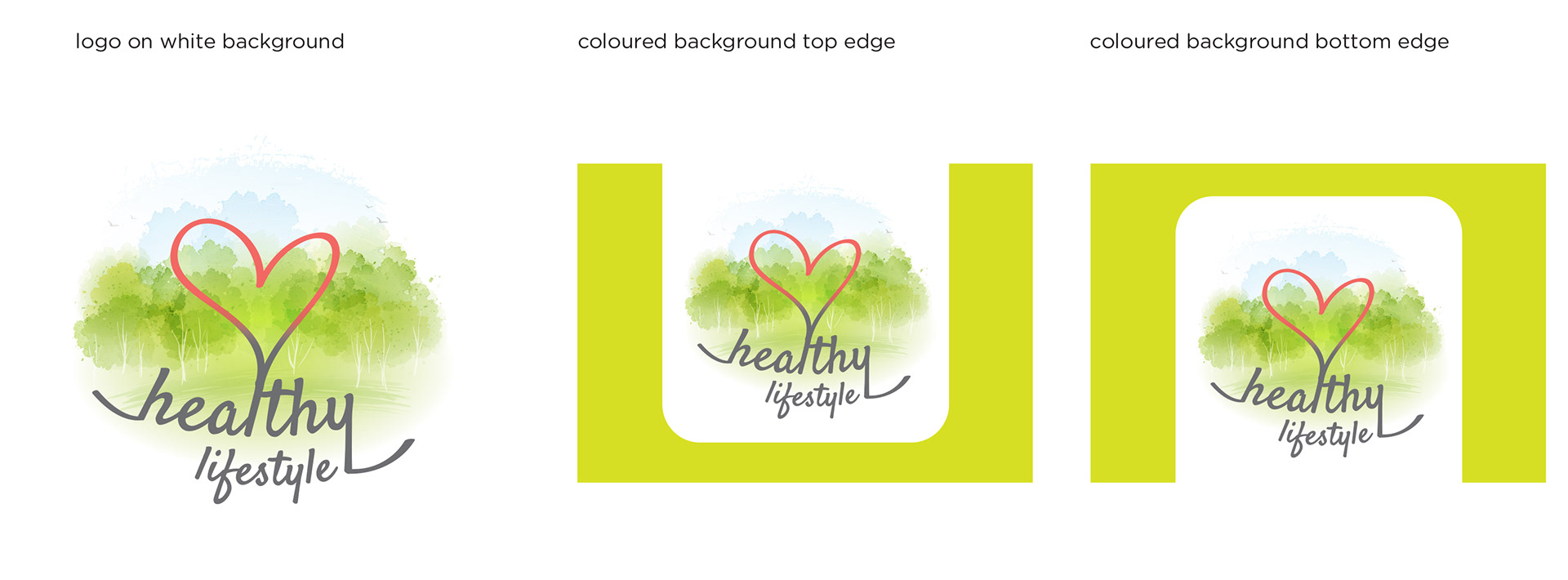
HEALTHY LIFESTYLE ICON [OPTION 1]
Creative Rationale: Living a healthy lifestyle doesn't necessarily just mean indoor activities or hitting the gym. The organic and natural look & feel in this icon is achieved through the watercolour effect. It encourages the audience to live and breathe with nature and the outdoors, especially for those who are mostly indoors 80% of the day.
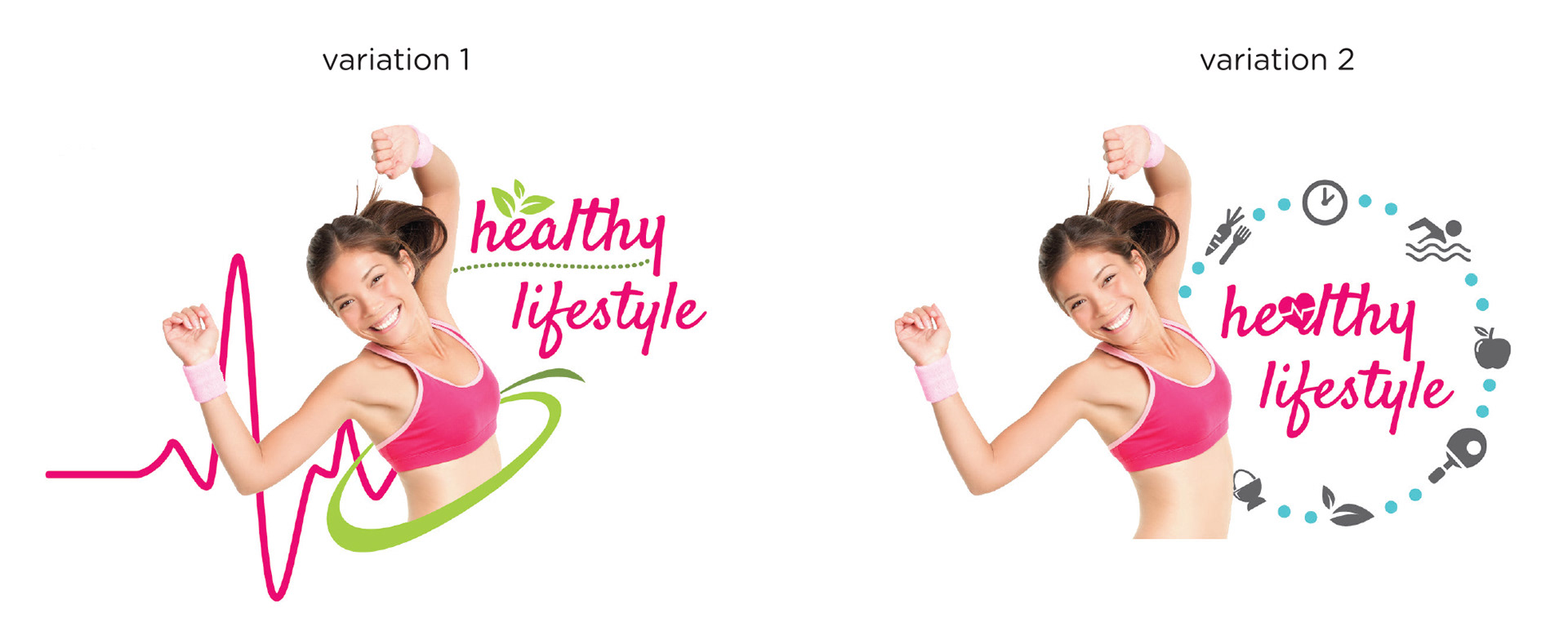
HEALTHY LIFESTYLE ICON [OPTION 2]
Creative Rationale: The proposed design comes with a realistic element to create a connection with the audience. The font type and simple graphical elements used enhances the overall look and feel as it brings out the joy and fun of living a healthy and active lifestyle. It paves the way for a well-balanced, healthier and happier you.